Since 2017, the NBA and Nike have teamed up to release City Edition jerseys for teams across the league. The idea was to celebrate the unique heritage of each city and connect with each fanbase on a more personal level.
The jerseys have been a hit and have boosted merchandise sales across the league. Now entering its sixth campaign, there has been much anticipation over what the City Edition jerseys will look like for each franchise. Popular designs in the past have included the Los Angeles Lakers paying tribute to Kobe Bryant with a snakeskin pattern and the Miami Heat’s extremely popular Vice series.
On Thursday, all of the City Edition jerseys for the 2022-23 season were released. Some of them were revealed a while ago, such as the Washington Wizards, who this spring released their ode to the area’s cherry blossoms. Others, such as the Los Angeles Clippers and Detroit Pistons, revealed their own tributes to local basketball mainstays. The Utah Jazz are the lone team without a City Edition uniform, but fans have been buzzing about the organization bringing back their purple jerseys.
Here are the 2022-23 City Edition jerseys, ranked from best to worst:
1. Detroit Pistons
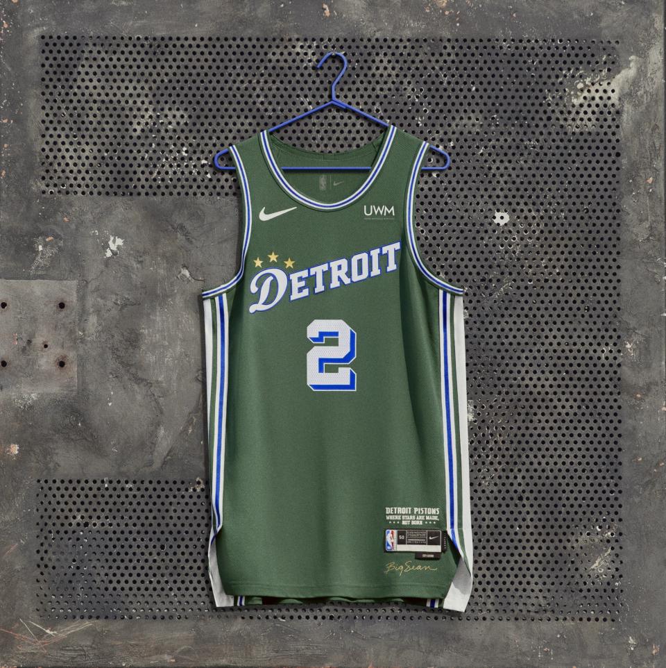
The Detroit Pistons take the prize for best City Edition jersey because it’s so unexpected yet so homegrown. The green jersey, designed in collaboration with multi-platinum rapper Big Sean, pays tribute to St. Cecilia’s, a local gym where stars like Jalen Rose, Isiah Thomas and others cut their teeth. “The Saint” is a place of refuge for local kids and the uniform embraces the gym’s saying: “Where stars are made, not born.”
2. Portland Trail Blazers
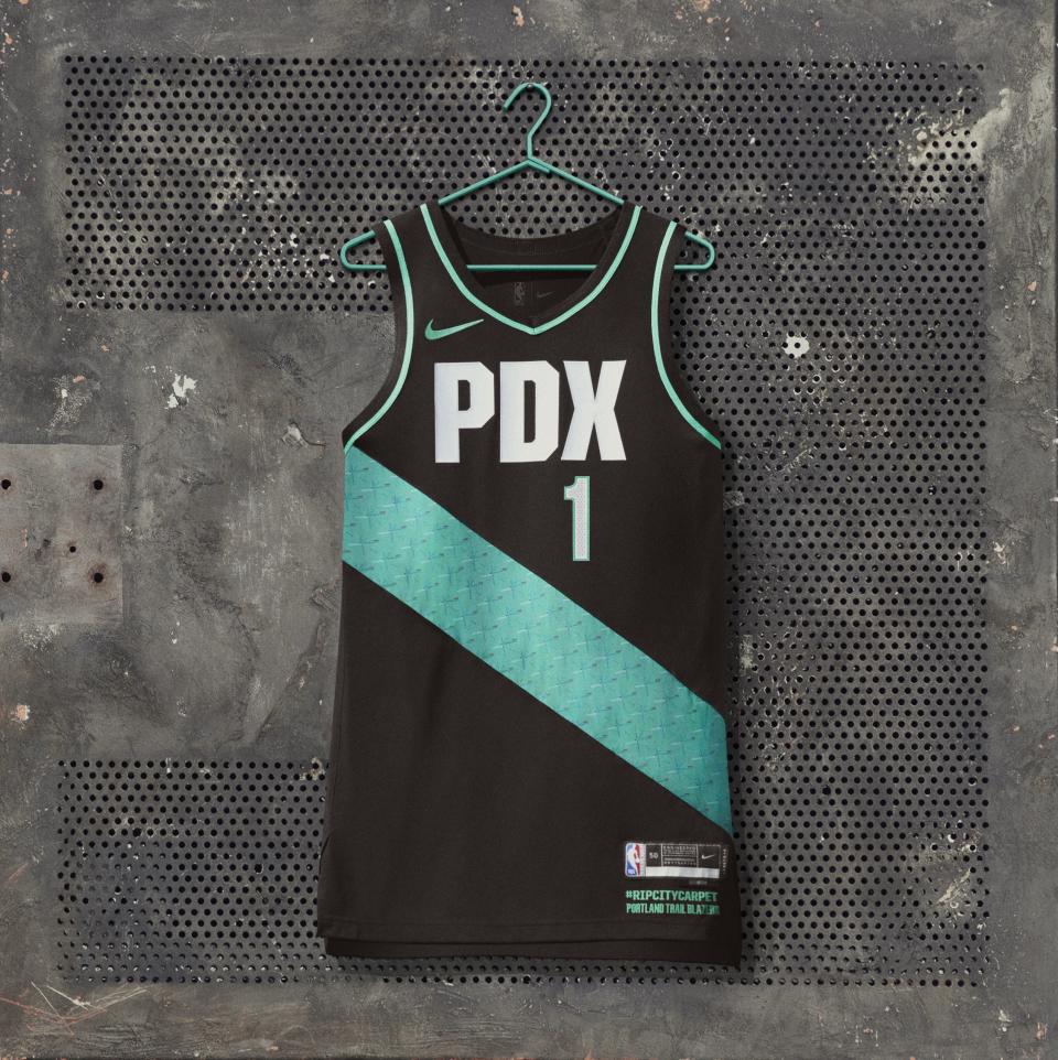
The Portland Trail Blazers used the opportunity to pay tribute to … the teal geometric patterned carpet at PDX airport. Yes. It’s so ridiculous it’s amazing.
3. Memphis Grizzlies
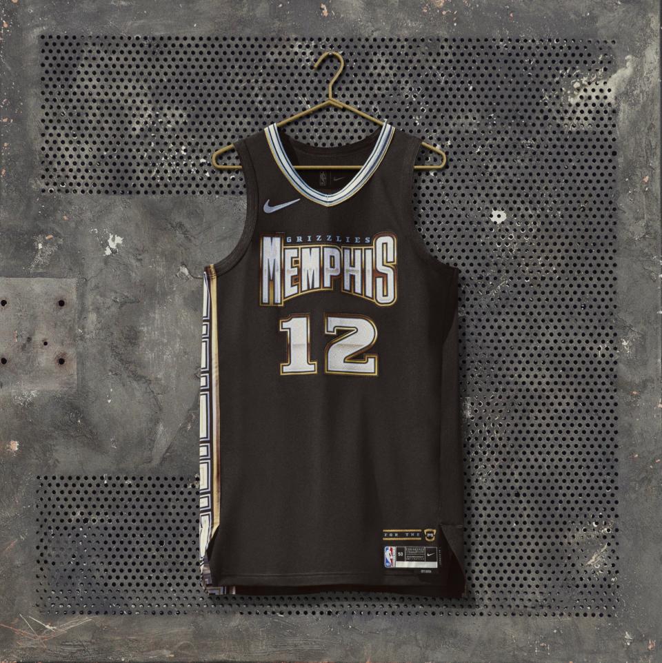
The Memphis Grizzlies made quite a statement with this one. They boldly embraced their city’s hip-hop heritage with gold and chrome details and a block wordmark that might appear on a Three 6 Mafia or Young Dolph album cover. The best detail is right above the jersey tag. There’s a gold grill in the shape of bear fangs.
4. Chicago Bulls
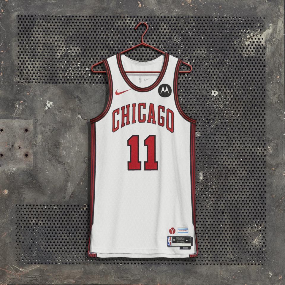
The Chicago Bulls went “if you know you know” with their City Edition jerseys. They built the whole design around the Municipal Y symbol, which represents the branches of the Chicago River coming together. The design is tasteful at first glance and has enough layers to make you really appreciate the thoughtfulness.
5. San Antonio Spurs
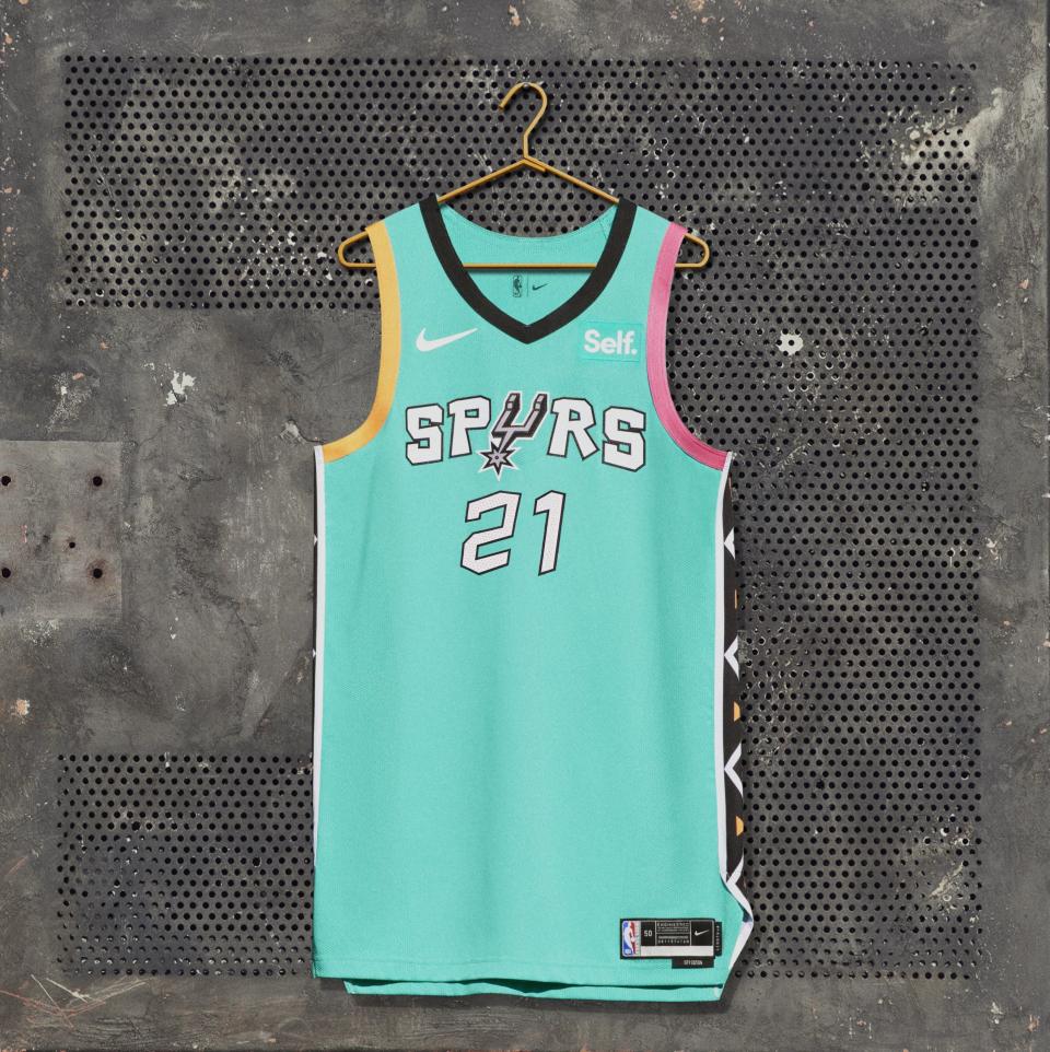
This one’s a winner. The San Antonio Spurs paid tribute to the 1996 NBA All-Star Game, which was held in the city and featured bright teal uniforms with geometric designs on the side. It’s a perfectly fresh throwback.
6. Oklahoma City Thunder
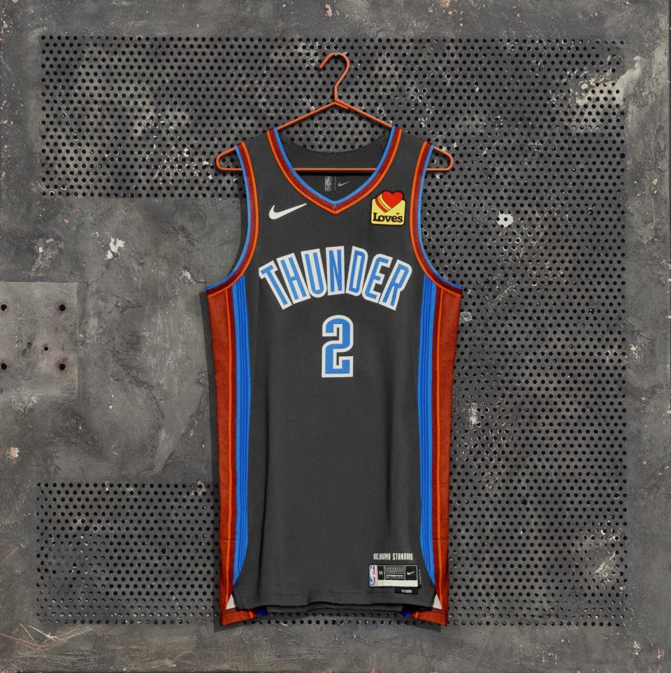
For their City Edition jersey, the Oklahoma City Thunder replaced their signature orange color with a ruddy red to exemplify the area’s grit and determination. The design from the outside is simple enough, but the detail that sent this uniform toward the top of the rankings is that inside, toward the heart area, there’s a patch of the Oklahoma Standard with the words “Service. Honor. Kindness.”
7. Los Angeles Clippers
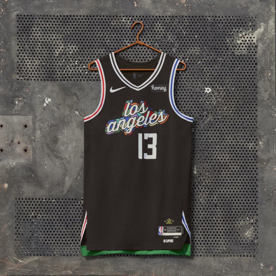
The Los Angeles Clippers paid tribute to the Drew League with their City Edition jersey. The wordmark combines the styles of the team’s and the local organization, which has made international news for its Pro-Am games. The touch of green at the bottom underneath the jersey and the inclusion of the Drew’s “No Excuses. Just Produce” motto are nice touches.
8. Atlanta Hawks
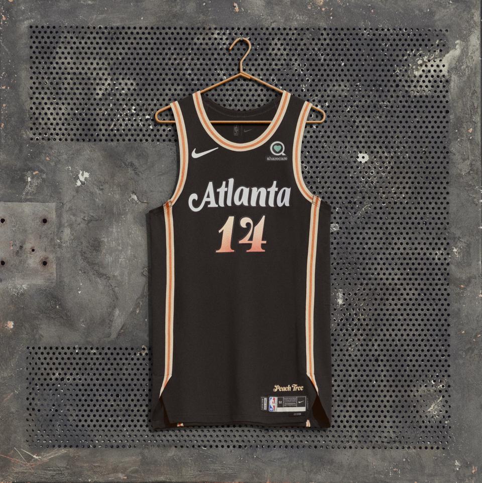
The Atlanta Hawks returned to their Peachtree Street homage, which was the design for the 2019-20 City Edition uniform. This one features a brighter orange and the “Atlanta” wordmark seems to be a subtle nod to Donald Glover’s landmark television show, which we must give props for.
9. Philadelphia 76ers
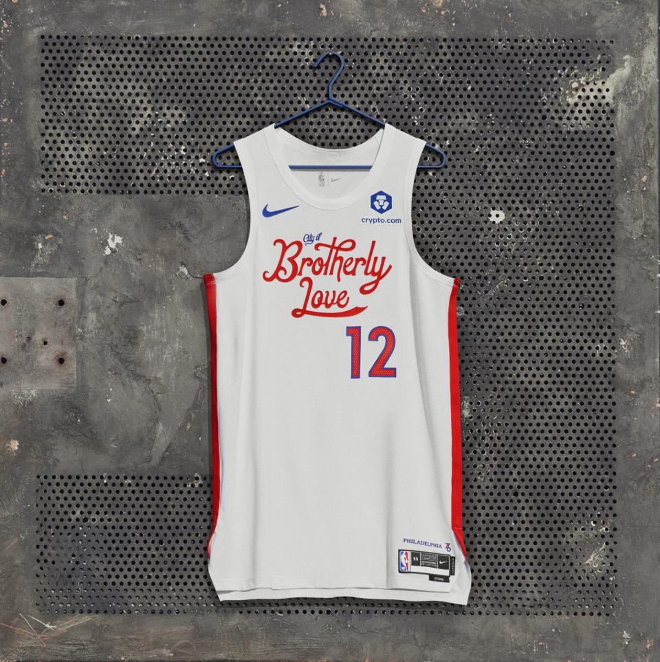
The Philadelphia 76ers sent the perfect message with their wordmark. The flowing text is just the right amount of welcoming while not being too nice. It’s a good reminder that Philadelphia is, indeed, the “City of Brotherly Love.”
10. Cleveland Cavaliers

The message behind the Cleveland Cavaliers’ City Edition jersey isn’t as deep as some others, but it’s just peaceful to look at. The toned down brown with the touch of blue for Lake Erie are really pleasant.
11. New Orleans Pelicans
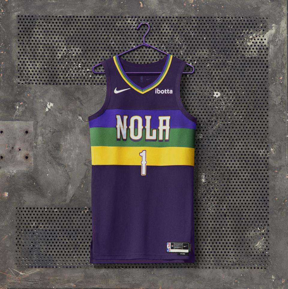
An excellent example of how to stray away from team colors but keep an identity is the New Orleans Pelicans, who celebrate Mardi Gras with bold purple, green and yellow stripes.
12. Dallas Mavericks
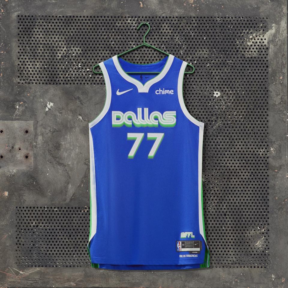
The Dallas Mavericks paid tribute to the Metroplex, the name bestowed upon the Dallas-Ft. Worth area in the 1970s to build hype for the area. The throwback design does exactly what it’s supposed to – be groovy.
13. Minnesota Timberwolves
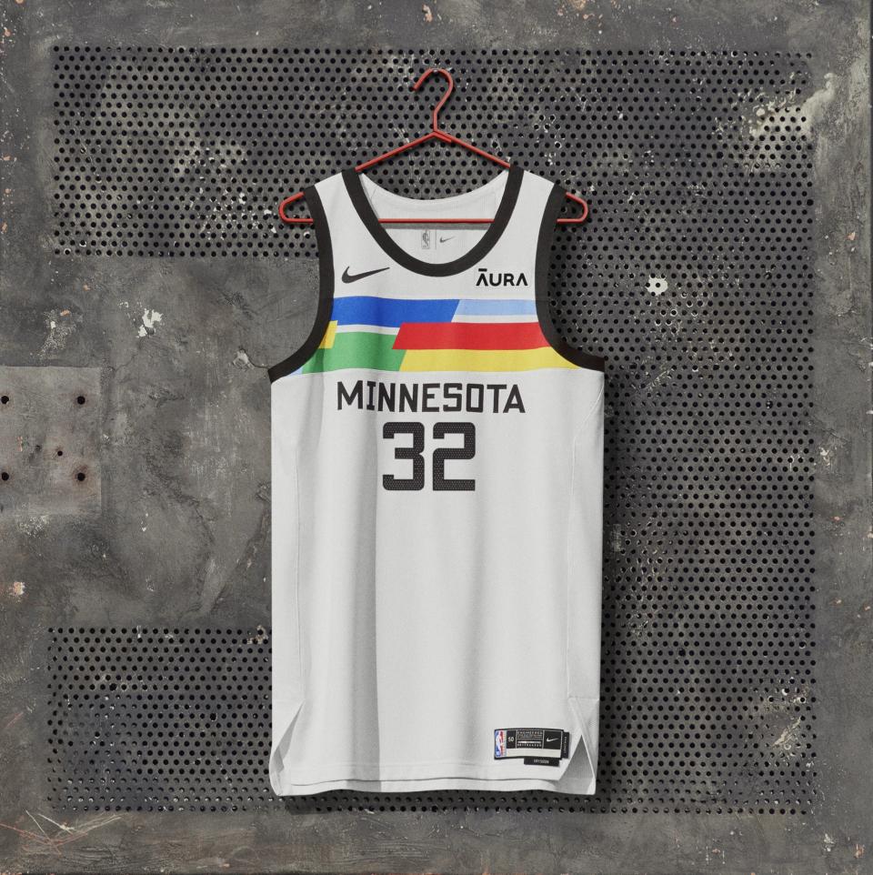
What’s really cool about the Minnesota Timberwolves’ jersey is that no jersey will be the same. The team opted for a simple white backdrop and dashes of bold color across the chest. The design is simple, but definitely piques one’s interest.
14. Milwaukee Bucks
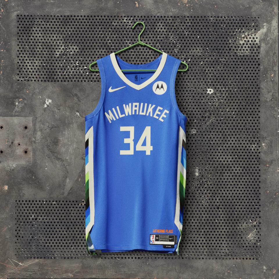
The Milwaukee Bucks pay tribute to Bronzeville, a hub for the Black community in the city. The color and side paneling take inspiration from the Patchwork mural and the team helped fund the restoration of the piece.
15. Los Angeles Lakers
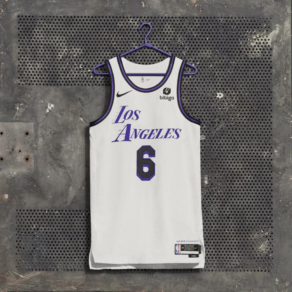
The Los Angeles Lakers’ City Edition jersey was intentionally left blank to express that the uniform isn’t the story. The purple pops without the obnoxious yellow distracting from it and there’s really something charming about the simplicity.
16. Washington Wizards
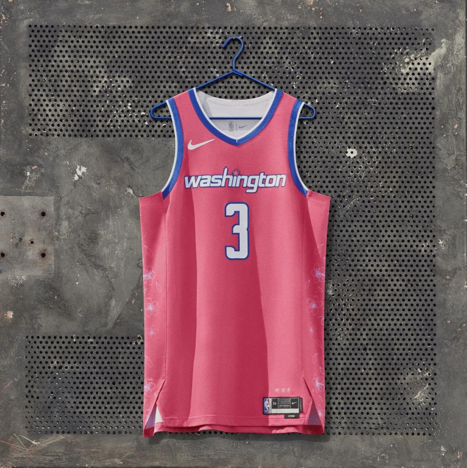
The Washington Wizards were one of the first NBA teams to reveal their City Edition jerseys this year when they did so with MLB’s Washington Nationals. The uniform pays tribute to the area’s iconic cherry blossoms. It’s bright and happy.
17. New York Knicks
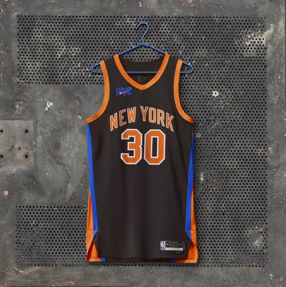
The New York Knicks did a really great job deciding to do a collaboration with KITH, a brand built on authenticity and cool. The idea is to harken back to the franchise’s glory days of the late 1990s and early 2000s, but this design isn’t really anything exciting or unexpected.
18. Toronto Raptors
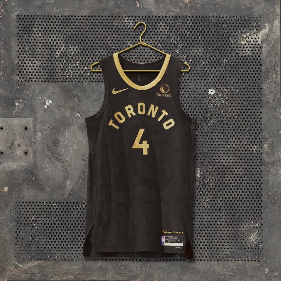
There’s actually some really cool details in the Toronto Raptors’ uniform. But they’re so well hidden that none of them make an impact. The black and gold just screams “Draaaake” in Soulja Boy’s voice.
19. Boston Celtics
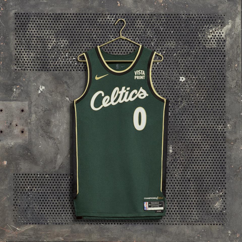
The Boston Celtics opted for a tribute to an all-time great, Bill Russell, with their City Edition uniform, dubbed “Champions of Gold.” It features 11 gold diamonds on the sides to represent Russell’s championships and the black paneling pays tribute to the legend’s pioneering role as a player (the league’s first Black MVP), coach (a two-time champ as the league’s first Black coach), and civil rights leader. It’s a beautiful thought, but the design is just kind of eh. An all-black jersey would have been much more powerful.
20. Indiana Pacers
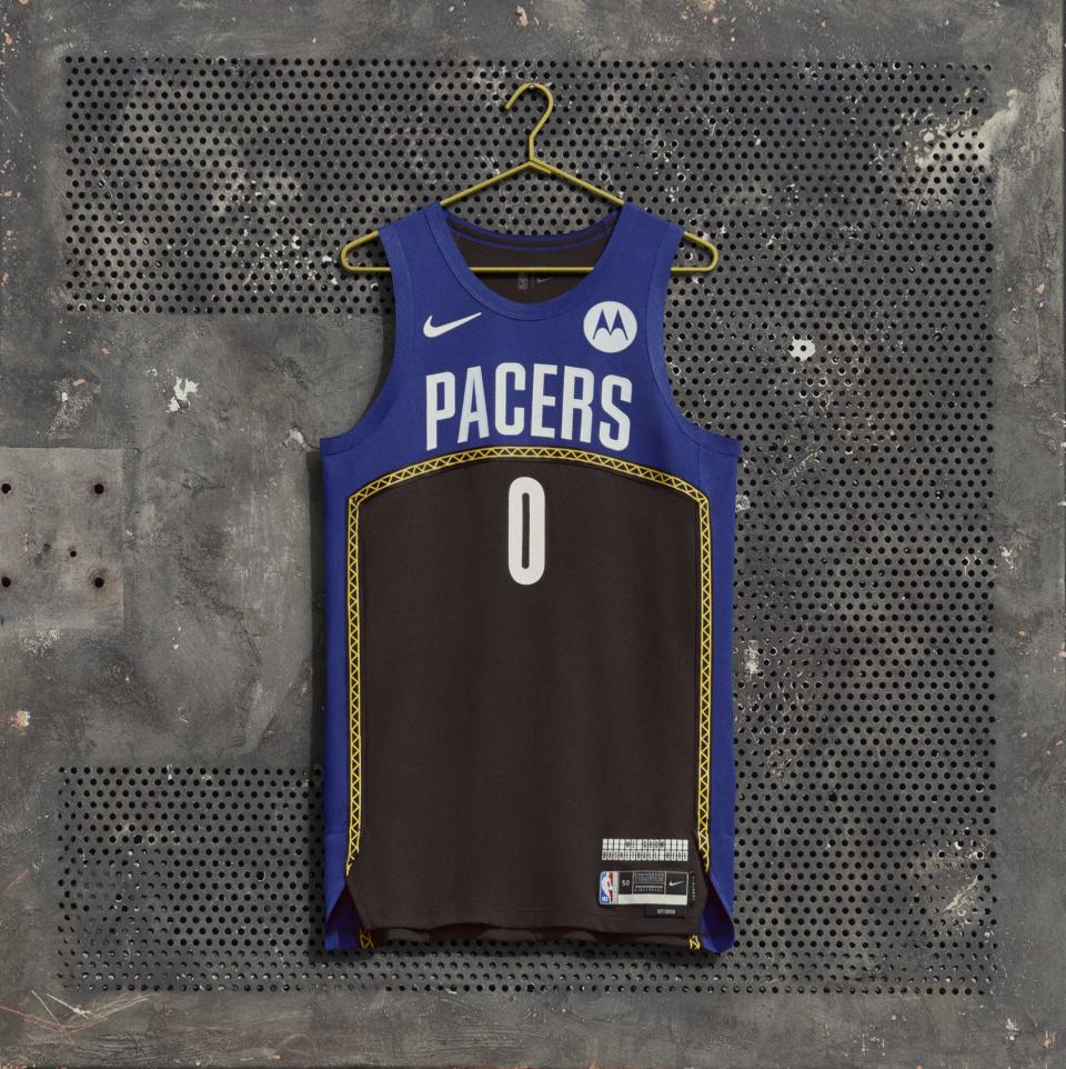
Here’s another jersey that pays homage to a local landmark. The Indiana Pacers celebrate the reopening of Gainbridge Fieldhouse, one of the most iconic venues in basketball. The problem with this design is they went just a little too literal.
21. Sacramento Kings
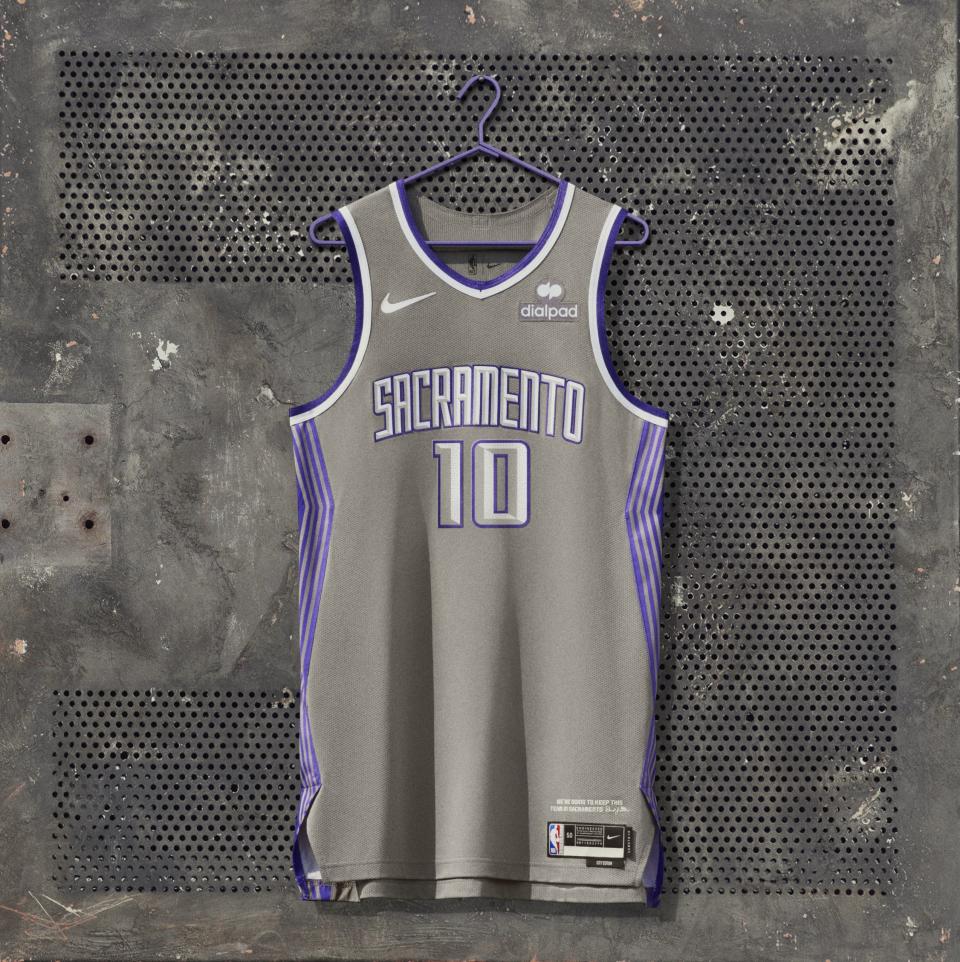
For the first time in franchise history, the Sacramento Kings have a grey uniform. It’s great that they’re trying something new with this tribute to the 10-year anniversary of the decision to stay in the state capital, but the design is not exactly earth-shattering.
22. Houston Rockets
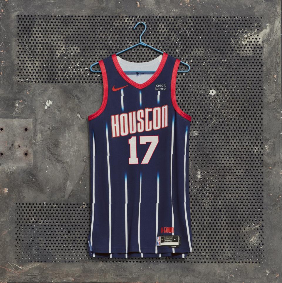
The Houston Rockets continued their celebration of their franchise history with a similar design as last year’s City Edition jersey. It combines various elements of uniforms from throughout their past. The jagged pinstripes are a little wonky.
23. Phoenix Suns
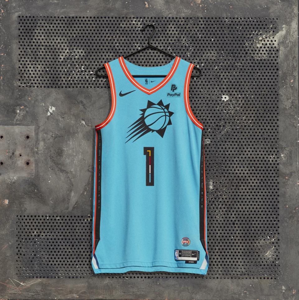
The Phoenix Suns honored the 22 Native American tribes in the state of Arizona with their City Edition uniform. Each color and detail is deeply symbolic, but the overall design isn’t quite working. Maybe it’s the use of the logo on the front instead of a wordmark?
24. Orlando Magic

Is it supposed to look like a villain jersey? The colors of the Orlando Magic City Edition jersey are really dark and the curves of the neck lining do appear to form the shape of Maleficent’s horns or something. But the design, meant to invoke a spirit of protecting one’s kingdom, doesn’t quite bring the menacing affect of a pair of black Air Force 1s.
25. Denver Nuggets

The idea behind the Denver Nuggets’ uniform is to pay tribute to the city’s “iconic architecture,” specifically Union Station. I’m from Denver and I didn’t know we had “iconic architecture.” There is one building that looks like a cash register because the top is a half circle, or maybe even Red Rocks Amphitheater would be unique to Denver, but otherwise, I’m not sure where this idea came from. The design elements are kind of basic and the story behind it feels generic.
26. Brooklyn Nets
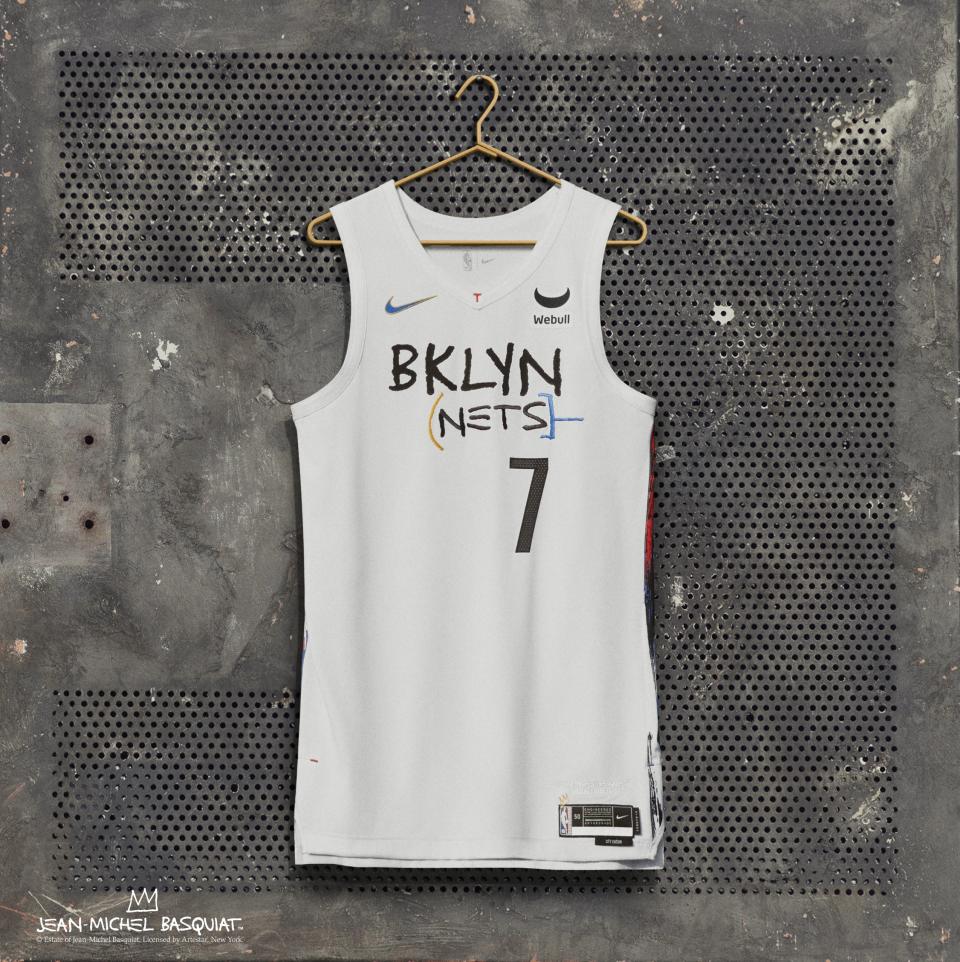
The Brooklyn Nets brought back their uniforms paying tribute to Jean-Michel Basquiat, except this time they’re on a white base. We completely support paying homage to the groundbreaking artist. But rehashing the same thought with such a lack of creativity is not how to celebrate the man. There is so much history and culture in the borough, they really couldn’t think of anything else?
27. Charlotte Hornets

The Charlotte Hornets brought back a previous concept for their City Edition uniform, again paying tribute to the fact that the city was a site for the original U.S. Mint. The city wordmark is also “CLT,” the airport abbreviation, but unlike the Portland Trail Blazers, the design elements just don’t connect here.
28. Miami Heat
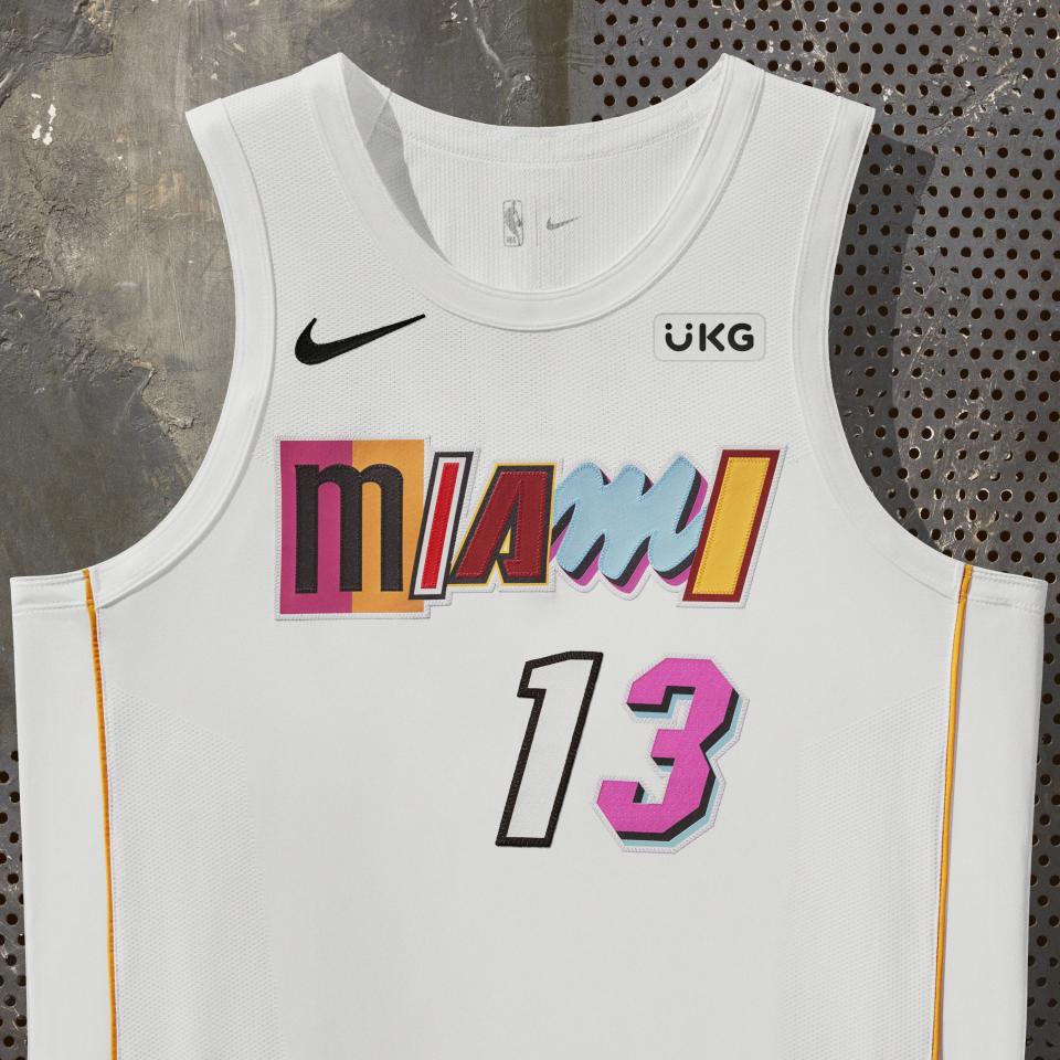
It was a sad day when the Miami Heat retired their Vice City uniforms. It would be an understandable decision if the team returned with an undeniably great design. But the repeated copy and paste look of this City Edition uniform just makes fans desire what once was.
29. Golden State Warriors

The Golden State Warriors’ City Edition uniforms are a tribute to women. The idea, designed by local artist Allison Hueman, is really pretty in concept, a bright yellow rose with architectural elements, but a big rule of fashion is to not stick something horizontally across the stomach area. The execution of this feels like the sneaker industry’s problem of “pink it and shrink it” except this time it’s “slap on a rose and see how it goes.”
This article originally appeared on USA TODAY: Ranking all 29 NBA City Edition jerseys for 2022-23 season


